Coordinating Flooring with Interior Doors
Flooring and doors occupy the largest visible surfaces in any home. If they are not selected in harmony, the space can feel unbalanced, even if each element is beautiful on its own. For this reason, selecting interior doors and engineered flooring deserves to be thought of as a single design decision.
This guide explains step by step how to identify undertones, when matching works and when contrast is more appropriate, plus the details that maintain visual coherence over time.
In short, if you establish the correct undertone, choose the relationship between hues and tie everything together through baseboards and hardware, the combination remains balanced for years to come.
How to Coordinate Flooring with Doors – A 3-Step Rule
First: Undertones (Warm / Cool / Neutral)
Most unsuccessful combinations between flooring and doors start with undertones chosen incorrectly. A shade may appear fitting in a showroom and different at home, because light and context change perception.
Undertone is the hidden chromatic base of a color. It is not about how light or dark the finish is—it is about its internal direction.
When the undertones of flooring and doors are in the same range or one of them is neutral, the result appears natural and stable over time.
Matching or Contrast? When Each Looks Premium
Once the undertone is established, the next decision concerns the visual direction of the space. There are two approaches that work very well in interior design. The difference between them depends on the atmosphere you want to create.
Coordinating Based on Flooring Color
Flooring color sets the overall tone of the home. Doors should be selected in relation to this base, and this is where the difficulty often arises: it is not always clear what shade works well and how to avoid combinations that feel forced after installation.
Below are combinations tested in real design projects, with clear explanations for each flooring type.
Light Flooring: Which Doors Enhance It
Medium Flooring: Safe Combinations and Combinations with Character
Dark Flooring: How to Avoid Visual Heaviness
Grey or Cool-Toned Flooring: Which Doors Complement It Correctly
Flooring with Strong Pattern (Knots or Herringbone)
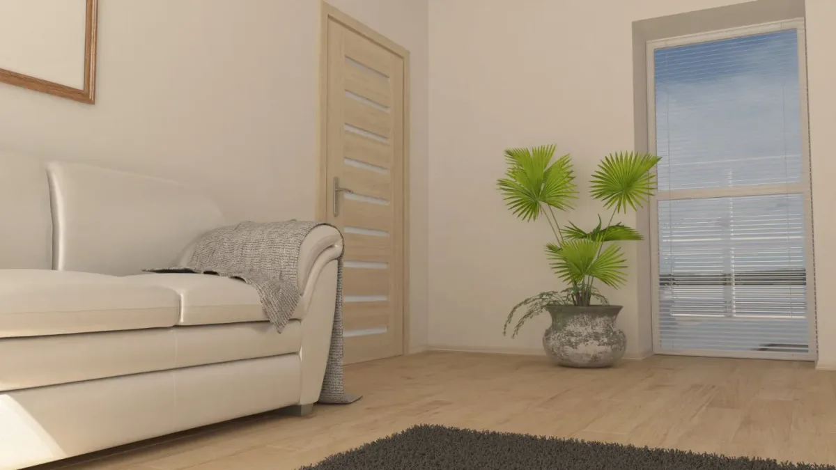
Light flooring amplifies light and creates an airy, spacious feeling. It is common in natural oak, whitewashed oak, beige or greige tones.
Doors that enhance this visual lightness:
- white selected on the correct undertone, for luminous continuity
- beige or greige, for a warm transition between floor and walls
- light wood close in chromatic temperature, for a uniform interior
- anthracite, for clear architectural definition in well-lit spaces
An important detail is choosing the undertone for white and grey, so the door does not appear yellowish or bluish next to the flooring.
Medium flooring brings visual balance. It is found in classic oak, light walnut, caramel or cognac tones. It is prominent enough to anchor the space without overwhelming it.
Safe combinations:
- doors in similar shades, with a difference of one or two tones
- warm white, for a bright interior
- neutral greige, for versatility
Combinations with character:
- anthracite doors, for a contemporary accent
- black doors, in homes with generous natural light
For a good result, the tone difference must be clearly perceptible, without extreme jumps.
Dark flooring brings depth and elegance. It appears in dark walnut, espresso or wenge tones. In small or poorly lit spaces it can visually dominate the room, which is why it is not highly recommended.
Doors that balance the overall composition:
- warm or neutral white, for visual openness
- light greige, for a contemporary transition
- light wood, to maintain a natural atmosphere
Very dark doors on dark flooring create a heavy interior, suitable only in spacious, well-lit spaces.
Grey and cool-toned flooring is present in modern industrial and minimalist settings. It requires carefully selected doors to avoid a rigid feel.
Appropriate directions:
- cool white or neutral white
- anthracite for controlled accent
- greige for balance between warm and cool
Doors with a yellow undertone shift the perception of the flooring and can create chromatic imbalance.
Flooring with pronounced pattern becomes the central element of the room. In this case, doors must remain visually calm.
The right choice:
- neutral shades
- subtle matte or satin finish
- simple hardware
This way the flooring remains the point of interest, and doors support the composition without visual competition.
Coordinating Based on Door Color
There are many situations where doors already exist in the home, and flooring is to be chosen later. In this case, doors become the fixed reference point, and the flooring must be selected so the final result appears intentional, not hastily adapted.
Coordinating Baseboards with Flooring and Doors
Coordinating with Frames, Thresholds and Hardware
Baseboard on Door Color vs Flooring Color (When and Why)
Baseboard in the door color is a good choice when you want doors to be the visual reference point and to have a clean transition between frame, baseboard and wall.
It works very well with white, greige or anthracite doors, especially in modern interiors where walls remain in neutral tones. A baseboard in the same shade as the door reduces differences between vertical elements in the room and helps when you have multiple doors on the same wall.
Baseboard in flooring color makes sense when you want the floor to appear larger and remain the main element. It is frequently chosen in small spaces or in classic interiors, where flooring continuity is important.
For a correct result, the baseboard must be as close as possible in shade and finish to the flooring, otherwise the differences are immediately noticeable.
Height and Profile: Visual Effect (Modern vs Classic)
Baseboard height changes room proportions. Low baseboards with straight profiles suit contemporary spaces and maintain a simple appearance. Taller baseboards with subtle profiles are appropriate in rooms with higher ceilings or in classic settings, where details have more presence.
The choice is made in relation to room height, door type and the overall style of the interior. A baseboard that is too tall in a low-ceilinged room can be visually heavy, while one that is too short in a spacious area may appear insufficient.
Corners, Joints, Transitions: Details That Elevate the Finish
Corners must be executed precisely, and joints should be as inconspicuous as possible. This is where installation quality is most evident. If the baseboard has many interruptions, misaligned ends or visible gaps, the final appearance is immediately diminished, even if the flooring and doors are well chosen.
At transitions between flooring and other finishes, thin and clean solutions are the most visually stable. Thick or highly contrasting profiles draw attention to the transition, and the floor appears fragmented.
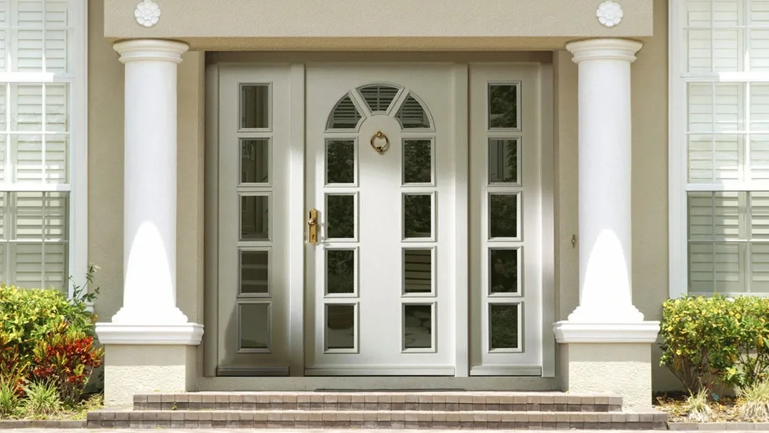
Classic Frame vs Flush Frame
A classic frame remains visible after installation and creates a clear boundary between door and wall. In this situation, frame color must be chosen together with the door and baseboard, because these three elements meet directly in the visual field. Shade differences between frame and baseboard are immediately noticeable, especially in side lighting.
Flush frame eliminates the visible border and aligns the door flush with the wall surface. The result is a continuous wall, interrupted only by the door panel. In this case, the visual connection between flooring and wall is made almost exclusively through the baseboard. For this reason, the shade of flooring and baseboard becomes more important than the frame color, because the frame no longer participates visually in the composition.
The choice between classic and flush frame influences the order of decisions. With a classic frame, door color is fixed first. With flush frame, flooring and wall are fixed first.
Thresholds and Flooring-to-Tile Transitions
The threshold has a technical role. It accommodates flooring expansion and covers level differences between finishes. In current designs, this element is kept as inconspicuous as possible.
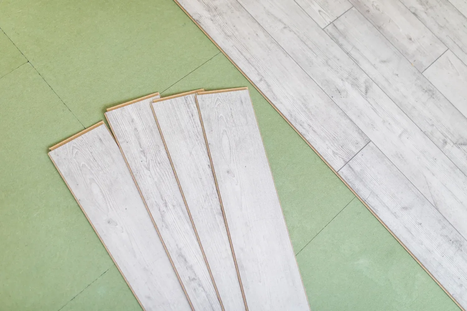
For a correct result, the threshold must be chosen based on flooring thickness and installation method. With triple-layer engineered flooring, dimensional stability allows the use of very thin profiles, almost flush with the floor. This reduces the risk of tripping during foot traffic and maintains visual continuity between rooms.
Threshold color is selected close to the flooring or in neutral metal when visible metallic hardware already exists in the interior. Thick or highly contrasting thresholds draw attention to the transition and fragment the floor into separate zones.
Handles and Metal Finishes: How to Choose Them
Hardware is what you interact with daily. For this reason, the finish of handles should be established early in the project, not at the end.
In a home, metal finishes repeat in several places: handles, transition profiles, bathroom fixtures, lighting fixtures. If these finishes are chosen randomly, easily visible differences appear between rooms.
A choice that remains stable over time requires maintaining the same metal finish throughout the main areas of the home. Matte black works well in modern interiors. Brushed stainless steel suits spaces with cool-toned flooring. Bronze or gold work well in spaces with warm-toned flooring and doors in natural shades.
The finish should be selected keeping in mind the level of shine. A glossy handle next to matte doors will draw unnecessary attention. A finish similar in texture maintains a uniform appearance.
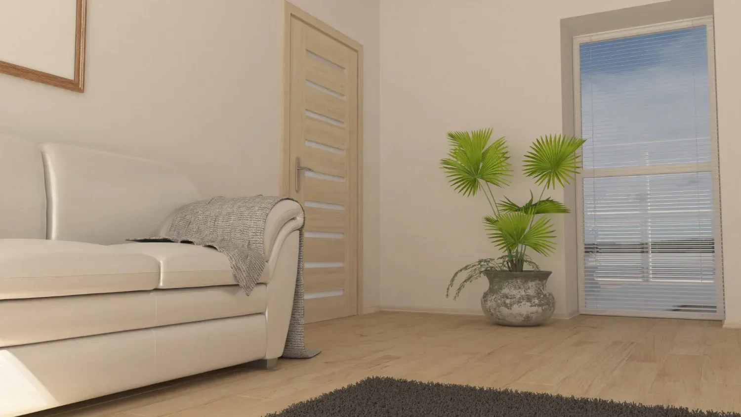
Coordinating Flooring with Doors in Each Room
The same combination of flooring and doors can look good in one room and less inspiring in another. Each space has different light, proportions and functions. Additionally, it is important to consider early on coordinating flooring with furniture, to avoid situations where, after installation, elements do not harmonize. For this reason, the choice should be verified in the context of each space, not just as a general image.
Common Mistakes
Below we present the mistakes that most often appear in interiors and spoil the final result, even though the flooring and doors are, individually, good choices.
Incompatible Undertones (Warm vs Cool)
Too Many Wood Shades in the Same Area (Flooring + Doors + Furniture)
Baseboards and Thresholds Treated as Final Details
Matte vs Glossy, with No Connection Between Finishes
Samples Not Tested in the Home's Natural Light
Decisions Made in the Wrong Order
Why it happens: people choose based on brightness or simple white, without checking the chromatic base. The flooring has one undertone (honey/gold or grey/smoky), while the door has another (warm white, cool white, neutral white). The difference becomes apparent after installation, especially in natural light.
How to spot it: next to the frame, the flooring appears more yellow than expected, or the door appears slightly grey/bluish. In photos taken in natural light, it is even clearer.
How to prevent it: compare a flooring sample placed next to a door sample (or frame sample), in the actual room, morning and evening. If you cannot test the door, you test different whites (warm/cool/neutral) next to the flooring and choose the option that does not change the perception of the wood.
Why it happens: each element is selected separately, from different stores, different veneers, different grain patterns. When they come together in the same visual field, the interior feels cluttered, without a clear direction.
How to spot it: in a single room you see 3–4 different wood elements, each with a different shade and different pattern (knots, grain, variations). The eye has nowhere to rest.
How to prevent it: you establish the main wood (usually the flooring). The remaining elements either follow:
- the same undertone family with a visible tone difference
- or painted finishes (white, greige, anthracite), especially on doors, when the flooring has a strong pattern
This is precisely why, if door installation takes place later, you can avoid this mistake.
Why it happens: baseboards and thresholds are left for last, and on installation day they are chosen very quickly. Small differences in white, shine or profile become evident immediately.
How to spot it: white baseboard is not the same white as the door, the threshold seems too thick, and transition profiles draw attention.
How to prevent it: choose baseboards and thresholds at the same time as doors and flooring. Request samples and place them side by side. Check two things: undertone and shine (matte/satin/glossy).
Why it happens: matte flooring and glossy doors (or vice versa) change how light reflects. The result looks uneven, especially on hallways and near windows.
How to spot it: in side lighting, the door "stands out" or the flooring appears dull next to shiny surfaces. The difference is more visible in the evening, with artificial lights.
How to prevent it: maintain similar shine levels between flooring, doors and baseboard. If you choose matte doors, go with matte baseboards and matte or subtle satin flooring.
Why it happens: the showroom has different lighting (usually controlled, sometimes warmer). At home, window orientation and bulb temperature change the shades.
How to spot it: what seemed like perfect white in the store appears yellowish at home, and the flooring seems greyer or more orange than expected.
How to prevent it: test samples in the actual room, next to the wall and next to the frame, at two different times of day. If you have very warm bulbs throughout the house, also test with them on, not just in natural light.
Why it happens: flooring is installed first, and doors are selected later without reference to the flooring, leading to limited selection options.
How to spot it: after installation, you look at the doors and feel they don't connect with the flooring, even though each product is good on its own. Especially with white and wood tones.
How to prevent it: the order that reduces risk is: define the flooring (and its undertone), choose the doors, choose the baseboard, then thresholds and hardware. When doors are already installed, flooring is selected based on the door undertone, not on photos.
Frequently Asked Questions About Flooring and Door Coordination
White Doors and Oak Flooring: Which White Should I Choose, Warm or Cool?
Oak almost always has a warm base, even when the shade appears neutral at first glance. For this reason, doors chosen in warm white or neutral white sit naturally next to the flooring. A cool white can make the wood appear more yellow than it actually is. The final choice is verified simply by placing the door sample next to the flooring in natural light.
Should Doors Be Lighter or Darker Than the Flooring?
Both directions can work well, as long as the tone difference is clear. Lighter doors keep the space bright and airy. Darker doors define transitions between rooms more firmly. The important thing is to avoid shades very close to the flooring, which can create the impression of an accidental choice.
Should I Choose Baseboard in the Door Color or Flooring Color?
The baseboard can follow the door color, for a calm transition between wall and frame. It can follow the flooring color, for flooring continuity. Regardless of choice, the undertone must be the same as the element it follows. This is where most visible differences appear after installation.
If I Already Have Flooring Installed, How Do I Choose Doors to Match?
When flooring is already installed, it becomes the starting point. Its undertone is identified, and then doors are selected in compatible shades. If the flooring has an accented pattern or large color variations, doors painted in white, greige or neutral tones offer the safest visual integration.
Can I Have Different Doors in Different Rooms Without Losing Visual Continuity?
Yes, if there is a common rule between them. This can be the undertone, the finish or the design line of the door. Different colors can work in different rooms, as long as they maintain the same finish family and the same visual proportion.