Matching Parquet with Furniture
Flooring and furniture define the largest part of a room's visual composition. If they are not chosen in direct relation to each other, the space may appear unbalanced after installation. Differences in colour, undertone, and texture become apparent in natural light, especially when you choose a premium laminate parquet, where the shade and pattern are clearly defined.
This guide shows how to coordinate parquet with furniture correctly, using rules applied to colour selection, identifying undertones, matching textures in each room, and common mistakes to avoid.
Parquet and Furniture Coordination, in Brief
When flooring and furniture are chosen in direct relation to each other, the space gains visual stability and remains pleasing over time. These rules are consistently used in premium interiors.
1. Establish the Parquet as the Base Element
2. Respect the Undertone
3. Maintain Clear Tonal Differences
4. Limit Wood Tones
5. Choose Balanced Textures
6. Check Samples in Natural Light
7. Think of Rooms as a Cohesive Whole
The flooring is visible throughout the entire home. Furniture is always chosen in relation to the parquet, not the other way around.
Warm-toned parquet pairs with furniture in warm or neutral tones. Cool-toned parquet pairs with furniture in cool or neutral tones.
Avoid furniture shades that are too similar to the parquet. Slightly visible differences appear intentional, not accidental.
In a single space, use a maximum of three wood tones, each with a distinct role: flooring, primary furniture, accents.
Parquet with pronounced pattern works better with simple furniture. Parquet with subtle pattern allows furniture with more visible detail.
Shades change depending on lighting. Testing in the actual space prevents poor choices.
The same combination should work from the hallway through the living room, without sudden shifts in style or colour temperature.
The Key Factor: Undertone (Warm, Cool, or Neutral)
Beneath each shade lies a subtle chromatic base that influences how elements sit together in natural light. This base is called the undertone. It can be warm, cool, or neutral. Overlooking undertone is one of the main reasons why parquet and furniture appear mismatched after installation, even if they look fine individually.
3 Coordination Strategies That Work Almost Every Time
After establishing the undertone, the next step is choosing how the parquet and furniture relate visually to each other.
Coordinating Based on Parquet Colour
Coordinating Parquet Based on Furniture Colour
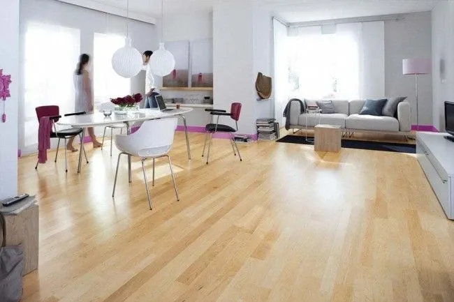
Light Parquet (light oak, beige, whitewashed): which furniture showcases it best
Light parquet is frequently chosen in bright interiors, where the goal is the sense of an airy, spacious feel and visual continuity. The modern finishes of Hywood parquet fit exactly into this category, with clean shades and uniform pattern, easily integrated with furniture in light or neutral tones.
Light parquet provides strong visual brightness and pairs well with furniture in white, greige, or natural wood. The result remains stable when there are clear tonal differences and an element that ties the palette together, such as textiles or accessories.
White / Greige / Natural Wood Furniture
Neutral white or warm white functions stably next to light parquet, especially in rooms with good natural light.
Greige is likewise a safe choice when you want a calm interior with similar tones, without appearing cold. Natural wood, with subtle pattern, maintains the natural direction of the flooring and helps when you want to introduce more wood material into the space.
What to Avoid (Too Washed Out, Lack of Contrast)
Avoid pairing very light parquet with equally pale furniture, without tonal differences. The space can appear flat, and furniture volumes get lost in the background. If you want a bright interior, maintain at least moderate contrast through textiles, worktops, discrete dark bases, or pieces in mid-tone.
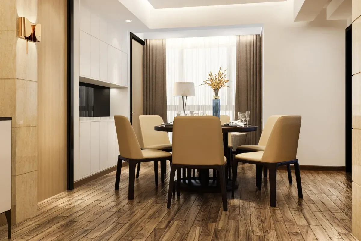
Natural Parquet (Natural Oak, Honey): Balanced Combinations
Natural parquet typically has a warm undertone and is easily integrated into most styles. Furniture in warm white, greige, beige, sand tones, or wood in the same undertone family pairs effortlessly. If you choose darker furniture, the difference must be clear to avoid a mismatched feeling.
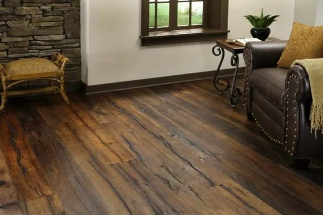
Dark Parquet (Walnut, Wenge): How to Keep the Space Bright
Dark parquet brings visual weight. Furniture and vertical finishes must compensate, otherwise the room can become dark, especially in spaces with limited natural light. The gloss level also matters significantly here—matte or satin finishes help maintain a stable appearance over time.
3 Recipes: Lighter Furniture / Repeated Accents / Rug + Walls
- Furniture lighter than the parquet, in warm or neutral tones, for visual balance.
- Repeated accents in the same shade at 2–3 points in the room, such as handles, metal profiles, light fixtures.
- Light rug and bright walls to lift the overall perceived light level.
Grey Parquet: What Furniture Makes It Look Modern
Grey parquet can have a cool or neutral undertone. Furniture is chosen in the same colour temperature direction, otherwise a sense of mismatch appears quickly. In modern spaces, the most stable combinations are those with clean surfaces, simple lines, and materials that don't compete with the flooring.
White, Glass/Metal, Light Wood (Scandinavian Style)
Neutral white and discrete metallic finishes work very well with grey parquet. Light wood functions when it has natural pattern and shade, to maintain an airy palette.
Discover our collection of double-layer parquet with over 90 models.
There are many situations where furniture is already purchased, and the parquet must be chosen later. In this case, the order of decisions is reversed. The furniture becomes the reference point, and the parquet must be selected to support the existing pieces both chromatively and visually.
White Furniture: Which Parquet to Choose (Warm vs Cool)
White furniture appears easy to integrate, however the undertone of the white completely changes the final result. The parquet must be chosen based on the chromatic base of the furniture.
Works well:
- warm white with parquet in warm or neutral undertone
- cool white with parquet in cool undertone or neutral grey
Testing samples in natural light remains essential, as undertone differences become visible quickly next to wood.
Grey / Greige Furniture
Grey and greige can have warm or cool bases. The parquet chosen must follow the same colour temperature to maintain visual stability.
Safe Pairings:
warm greige with natural parquet or light oak
cool grey with grey parquet or oak with cool undertone
If the furniture has a matte finish, parquet with reduced gloss maintains surface continuity.
Black Furniture: Which Parquet Makes It Premium
Black furniture creates strong contrast. The parquet must bring visual brightness to balance the composition.
- Stable Results:
- light or natural parquet
- walls in bright tones
- light textiles for overall balance
Very dark parquet next to black furniture requires large spaces and abundant natural light.
Wood Furniture (Different Species): How to Avoid Too Many Shades
When furniture displays visible wood, the parquet must be chosen carefully to avoid accumulating different species in the same space.
Applied Solutions:
- bringing the parquet undertone close to the furniture undertone
- choosing a shade sufficiently different for clear separation
- limiting a maximum of three wood tones in one room
For quick orientation on the available palette, the parquet colour selection helps you quickly see which variants work with your already-chosen furniture.
Matching Parquet Texture and Finish with Furniture
Coordinating Parquet by Room
Colour is only part of the choice. The wood texture and gloss level of surfaces influence the final result equally. Two materials can have compatible shades but appear mismatched due to differences in light reflection or grain pattern.
Matte, Satin, or Gloss
The gloss level controls how light reflects in the room. Large differences between parquet and furniture become especially visible in the evening, under artificial light.
- Matte or satin parquet naturally pairs with furniture with matte finish. This combination creates calm, visually stable surfaces.
- Gloss parquet requires furniture with similar reflection properties, otherwise shine contrasts appear that attract unnecessary attention.
In design, reduced-gloss finishes are preferred because they maintain a uniform appearance over time and more easily hide traces of use.
Strong Knots or Subtle Pattern
Some parquet types have pronounced grain and visible pattern variations. Others have uniform, linear surfaces. Furniture must be chosen so it doesn't compete with the flooring.
- Parquet with strong pattern works better with furniture with simple, smooth fronts.
- Parquet with subtle pattern allows furniture with more expressive textures, fluting, or visible detail.
This rule helps avoid visual overload in a single area.
Wide Planks and Herringbone Installation
Parquet format influences the perceived proportions of the room. Wide planks create continuity and pair well with generous furniture sizes and simple lines. Herringbone installation draws attention through rhythm and pattern, and furniture must be chosen with clean shapes, without excess detail.
In spaces where furniture is already complex in volume or style, simple-installation parquet maintains overall balance.
Coordinating Parquet with Bedroom Furniture
The bedroom needs a calm, visually stable atmosphere. Parquet in natural or light tones, with subtle pattern, pairs well with furniture in warm white, greige, or wood with a similar undertone. Matte or satin finishes help maintain a peaceful appearance, without strong reflections in artificial light.
In small bedrooms, very dark parquet and dark furniture can reduce the sense of space. In this case, light textiles and bright walls balance the composition.
Coordinating Parquet with Living Room Furniture
The living room is the area with the greatest visual exposure. Here, flooring, furniture, and decorative elements are visible simultaneously. The parquet must be chosen to support the main pieces.
Simple-pattern parquet allows more expressive furniture in volume or colour. Pronounced-pattern parquet requires simple furniture with smooth fronts. Tonal differences must be carefully analysed, especially in open-plan spaces where flooring is continuous.
Coordinating Parquet with Hallway and Foyer Furniture
Hallways typically have limited natural light. Light or natural parquet helps maintain a bright space. Furniture in white, greige, or light wood preserves visual continuity between rooms.
In narrow corridors, parquet with simple format and suspended or low-volume furniture contributes to the sense of an orderly space.
Details That Help You Coordinate Parquet with the Rest of the Room
After parquet and furniture are established, there are several elements that can visually balance the space without changing the main pieces. These adjustments are frequently used in professional interiors to tie the flooring to the rest of the room.
- Rugs reduce overly strong contrasts between parquet and furniture and define functional zones
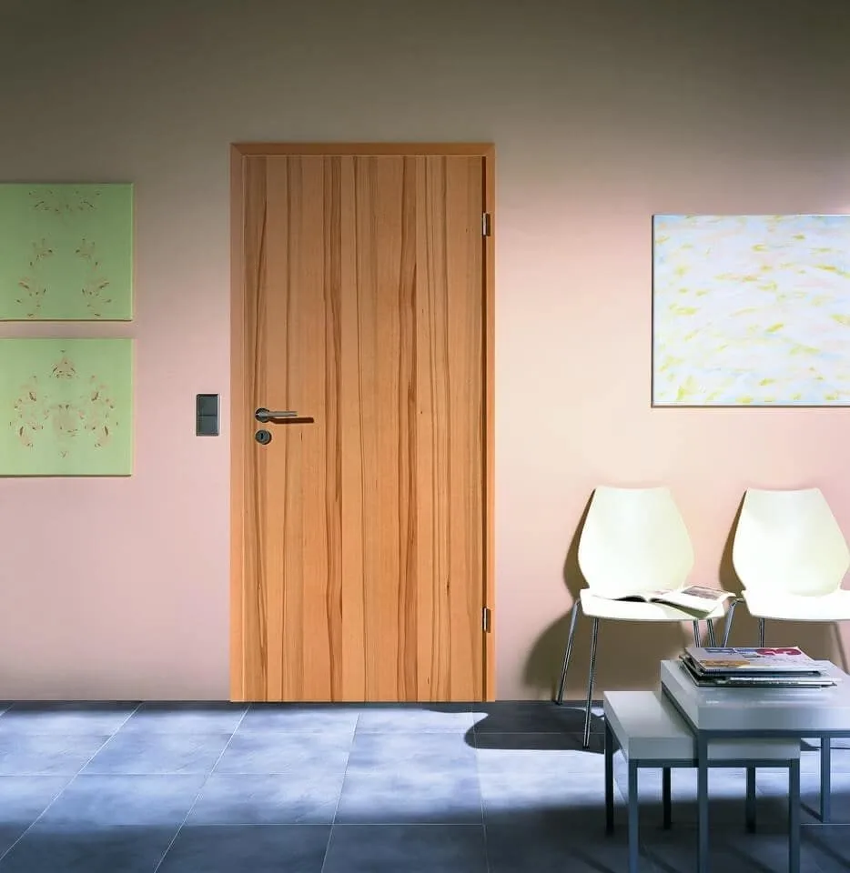
- Coordinating parquet with interior doors
- Decorative pillows and upholstery can pick up shades from the parquet for colour continuity
- Curtains influence the visual temperature of the room and should be chosen in an undertone compatible with the flooring
- Metallic accessories (handles, table legs, light fixtures) help repeat accents
- Mirrors and artworks interrupt large wood surfaces and prevent visual overload
Common Mistakes
Even if parquet and furniture are chosen separately with care, their combination can create visual problems after installation. Below are the situations most commonly encountered in residential projects.
Incompatible Undertones (Warm vs Cool)
Too Many Wood Shades in the Same Area
Everything at the Same Brightness Level
Ignoring Rugs and Upholstery
This mistake occurs when parquet and furniture have different chromatic bases. For example, warm-toned parquet next to cool-toned furniture. The difference becomes evident in natural light, even if it didn't seem problematic in the showroom.
When parquet, furniture, and other wood elements have different species and tones, the space appears cluttered and lacks clear direction.
It is avoided by establishing a single dominant wood element and choosing the other finishes in similar or neutral tones.
Showroom lighting does not reflect real conditions in a home. The same shade can appear different in the morning or evening.
Testing samples in the final space prevents most poor choices.
Rugs and textiles can balance differences between parquet and furniture. If they are completely ignored in planning, the final result may appear chromatively disconnected.
It is recommended that these elements be considered in the selection phase.
Final Checklist (Before You Buy)
Go through the list below before choosing your parquet or furniture. Each point verified reduces the risk of a mismatched combination after installation.
- ☐ I have identified the parquet undertone (warm, cool, or neutral)
- ☐ I have identified the furniture undertone, existing or desired
- ☐ I have compared parquet and furniture samples side by side
- ☐ I have checked samples in natural light, morning and evening
- ☐ I have maintained a clear tonal difference between parquet and furniture
- ☐ I have limited the number of wood tones in the same area
- ☐ I have checked the gloss level of both parquet and furniture
- ☐ I have taken rugs and upholstery into account
- ☐ I have analysed how the combination looks from hallway through rooms
- ☐ I have chosen skirting boards and thresholds in the same phase as the parquet
Frequently Asked Questions About Parquet Colours
What Furniture Works with Dark Triple-Layer Parquet?
Dark parquet brings visual weight and needs furniture that brightens the space. Furniture in warm white, greige, or light wood maintains chromatic balance. This rule is frequently applied when you choose triple-layer parquet in dark shades, because the pattern and colour depth become a dominant element in the room. If furniture is also dark, walls and textiles must be bright to avoid overloading the space.
Dark Parquet and Light Furniture: Which Wall Colours Prevent Harsh Contrast?
Walls in warm white, light beige, or greige. Avoid cool white, as it emphasizes the difference between flooring and furniture.
Grey Parquet: Which Furniture Colours Warm It Visually?
Light wood, beige, warm greige, or textiles in sand tones. These reduce the cold feeling of grey flooring.
Can I Combine Furniture from Two Different Wood Species with the Same Parquet?
Yes, if one species is dominant and the other appears only as an accent. The undertones must be compatible.