Parquet colours: how to choose and coordinate them in 2026
If you've recently renovated or are building a new home, you've likely already envisioned how the rooms will look in the end. Perhaps you've saved inspiration shots, chosen a style that suits you, and begun visualising the sofa, dining table, and lighting fixtures.
Yet design becomes far simpler the moment you start from the flooring. Parquet colour establishes the backdrop for everything that follows and determines whether furniture will integrate naturally or appear separately selected.
Many discover too late that the flooring shade doesn't match their initial plan or has completely altered the room's appearance. Compromises emerge: rugs chosen merely to mask colour differences or a sense that the interior doesn't convey the desired atmosphere.
For contemporary premium interiors, engineered parquet offers stability, controlled shades, and elegant finishes—elements that help achieve harmonious results without forced adjustments later.
In this article you'll find the reference points designers use when selecting floors, the types of parquet suited to different spaces, shades that build visual coherence, and straightforward ideas for creating a pleasant atmosphere in your home.

In brief: how to choose parquet colour
Selecting the right shade becomes easier when you view the flooring as part of a whole. Designers always check these aspects before making their final decision:
- Room dimensions – light tones aerate compact spaces, deep shades add visual weight to spacious rooms.
- Natural light – room orientation influences how you perceive colour throughout the day.
- Undertone – differences between warm, cool, and neutral determine whether furniture and flooring harmonise naturally.
- Wall colour – light backgrounds enhance parquet, powerfully coloured walls require balanced shades.
- House style – contemporary interiors favour chromatic simplicity, classical ones lean toward rich tones, natural styles choose shades close to raw wood.
- Maintenance – certain colours conceal dust and daily marks more easily.
- Continuity throughout the home – smooth transitions between rooms create visual flow.

Which parquet colours are trending in 2026
Contemporary interiors are moving away from harsh contrasts and artificial sheen. In 2026, attention shifts toward naturalness, authentic materials, and tones that foster calm.
Types of parquet colours
Beyond personal preferences, certain shades solve concrete problems of space, light, or decorative logic. When designers select parquet types for a home, they always start from the desired visual effect, then adapt the technical structure of the flooring to the household's lifestyle.
What to consider when choosing parquet colour
A beautiful shade on a sample can look different once installed across the entire room surface.
Designers analyse several essential aspects before making the final choice, so the flooring functions properly in daily life. Even parquet care becomes simpler when the shade conceals dust and daily traces.
Choosing parquet colour based on walls
Walls and flooring work together. When their shades support each other, the space feels natural and well-considered. If they conflict, the interior acquires a slightly haphazard feel, even if the furniture is beautiful. That's why designers always choose parquet in direct relation to wall colour, never separately.
Parquet colour + white walls: combinations that look premium
Coloured walls
Dark walls
White walls offer the greatest freedom but also the greatest responsibility. Because the backdrop is neutral, the flooring becomes the element that defines atmosphere.
Examples that consistently work in premium interiors:
- Bleached oak + warm white – bright, soft interior with Scandinavian character
- Natural oak + neutral white – timeless balance, easy to furnish
- Honey oak + buttery white – warm, inviting atmosphere
- Greige + pure white – contemporary, architectural look
- Walnut + cream white – elegant contrast with depth
- Smoked oak + matte white – rich texture, sophisticated space
- Blonde oak + sandy white – calm, natural interior
When walls have colour, the flooring must stabilise the composition, not compete with it.
Applied examples:
- Sage green walls + natural oak – calm, organic interior
- Petrol blue walls + walnut – deep, elegant décor
- Sandy beige walls + blonde oak – luminous, natural atmosphere
- Terracotta walls + honey oak – warm, Mediterranean space
- Light grey walls + greige – modern continuity
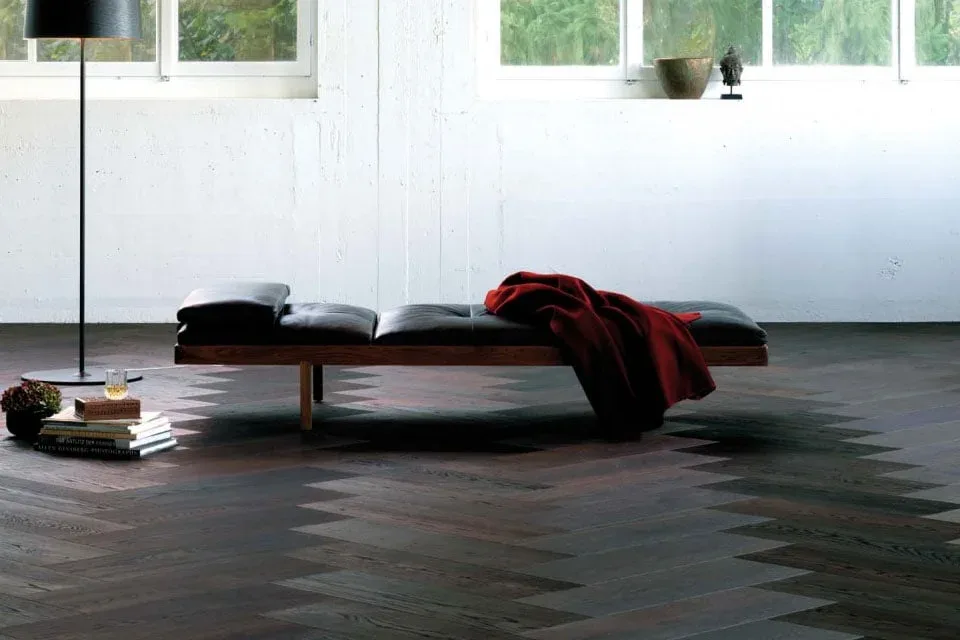
Dark walls create dramatic, refined décor but require flooring that maintains visual balance.
Successful combinations:
- Anthracite walls + blonde oak – controlled contrast, modern
- Navy walls + natural oak – depth without excessive darkening
- Forest green walls + smoked oak – texture upon texture, premium result
- Chocolate brown walls + honey oak – warm, enveloping interior
Here, artificial lighting plays an important role. In such décor, light or medium parquet prevents a space from feeling oppressive.
Parquet colours by room
Each room has its own rhythm. Some demand light and ease, others stability and durability. Choosing the right shade for each zone of your home helps achieve a cohesive interior that looks good even after years of use.
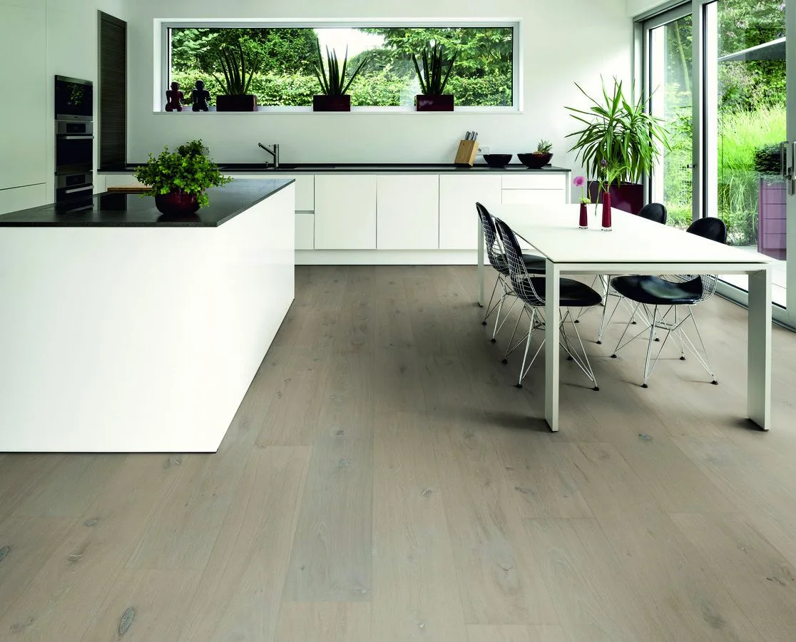
Parquet colours for living rooms
Parquet colours for bedrooms
Parquet colours for kitchens
Hallways and high-traffic areas
The living room is the space that draws the most activity and attention. Here, balanced shades work best—ones easily integrated with furniture and textiles.
Most common choices:
- natural oak
- light honey oak
- greige
These tones offer warmth, suit almost any furniture type, and allow you to change the décor without needing to replace the flooring.
If the living room is open-plan, avoid very light tones – they can seem too "fragile" over large surfaces. Instead, medium natural oak or honey oak creates visual stability and anchors the relaxation zone.
For a modern living room with white or light grey walls, greige is one of the most appreciated current choices because it maintains a contemporary look without feeling cold.
The bedroom requires visual calm. Flooring should contribute to a serene atmosphere without drawing attention.
Safe choice:
- blonde oak
- light natural oak
- bleached oak
These shades reflect light gently, pair well with light textiles, and create the sense of an airy space.
For bedrooms with coloured walls (sage green, dusty blue), natural oak remains the most stable option.
The kitchen is an intensive-use zone where daily marks become visible quickly. Very light or very dark shades demand more attention.
Most practical choices:
- medium natural oak
- honey oak
- medium greige
These tones better conceal fine dust, dried splatters, or crumbs, maintaining a neat appearance longer.
Practical tip: avoid very light parquet in heavily used kitchens. It requires more frequent cleaning to look impeccable.
The hallway supports the most foot traffic in the home. Here, both durability and how well the shade hides daily wear matter. That's why premium projects frequently use HyWood parquet, appreciated for its durability and stability.
Suitable shades:
- medium natural oak
- honey oak
- light smoked oak
Avoiding extremely light or extremely dark tones helps maintain a consistent appearance, even in heavily trafficked areas.
Parquet colours by house style
Usually, people know which style appeals to them. "I want something minimalist." "I want it warm." "I want it to look elegant." The challenge emerges when that style must translate into concrete choices. Parquet colour is one of them. Below are variants created by designers for cohesive results.
Minimalist / contemporary
Scandinavian / japandi
Classic elegant
Industrial
Minimalist interiors need flooring that doesn't draw unnecessary attention but provides visual balance.
Most suitable shades: greige, light natural oak, oak with neutral undertone.
These tones create a clean backdrop for furniture with simple lines, matte surfaces, and limited colour palettes. In contemporary spaces with much white and grey, greige remains one of the safest choices to avoid a cold feel.
These styles emphasise light, natural materials, and a sense of calm.
Recommended shades: bleached oak, blonde oak, light natural oak.
These floors reflect light, keep wood grain visible, and combine easily with linen, cotton, or wool textiles. In japandi, where furniture is low and simple, light natural oak maintains balance between warmth and minimalism.
Classical interiors demand depth and materials that convey refinement.
Suitable shades: honey oak, walnut, medium smoked oak.
These tones pair with solid wood furniture, gold or bronze metal details, and rich textiles. Walnut remains the emblematic choice for classical décor because it adds visual gravitas without appearing heavy.
Industrial style relies on concrete, metal, glass, and controlled contrasts.
Recommended shades: greige, oak with grey undertone, smoked oak.
These floors suit exposed concrete or brick walls and black metal. Greige is preferred in modern lofts because it creates continuity between flooring and cool architectural finishes.
Common mistakes when choosing parquet colours
Most problems arise from small impulsive decisions. Parquet looks different on a small sample than across an entire surface, and once installed, it's not easy to change. Here are situations that occur most frequently in real homes:
1. Sample viewed only in the showroom
2. Parquet chosen separately from doors and baseboards
3. Too strong a contrast without a lighting plan
4. Ignoring the undertone
5. Choosing a colour that highlights every trace
Shop lighting is uniform and strong. At home, you have natural light, shadows, and variations throughout the day. A shade that seems warm in the showroom may become cool in your living room. The sample must be tested directly in your room, near the window, morning and evening. Only then does the true colour become clear.
Small shade differences seem unimportant until everything is installed. If doors come in warm oak and the parquet has a cool undertone, the interior appears disjointed. Baseboards are visually part of the flooring, and the mismatch shows daily.
Parquet, doors, and baseboards are chosen at the same stage.
Very dark parquet, dark walls, and weak light can create an oppressive space, even if photos look spectacular. Large contrasts work only when there are generous windows or well-planned illumination. Without these, the atmosphere becomes tiring over time.
Honey oak next to grey-blue furniture. Greige next to warm beige furniture. Each element is beautiful separately, but together they don't sit naturally.
Very dark parquet in a home with children or pets. Very light parquet in an intensively used kitchen. Some shades require more daily cleaning than others. Your choice must account for how you live in the space, not just how it looks on day one.
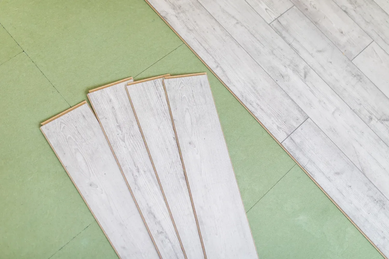
Once the right colour is established, the next important step is parquet installation, because how the parquet is installed influences its final appearance and behaviour over time.
Frequently asked questions about parquet colours
When should I choose a dark parquet colour?
Dark parquet works well in sufficiently large spaces with generous natural light and a well-planned lighting scheme. It's a suitable choice for spacious living rooms, elegant offices, or bedrooms with light walls, where contrast brings depth. In small or poorly lit rooms, very dark tones can make the space feel tighter.
When should I choose a light parquet colour?
Light parquet is ideal in apartments, bedrooms, narrow hallways, or any space needing more visual light. It helps rooms appear larger and airier. It's an inspired choice if you love natural, Scandinavian, or japandi décor, or if you want total freedom when selecting furniture.
Which shades make a room appear more spacious?
Bleached oak, blonde oak, light natural oak, and light greige have this effect. They reflect light, reduce harsh contrasts, and visually elongate walls. In small rooms, the difference is felt immediately after installation.
What parquet colour suits white walls?
With white walls, natural oak provides balance, honey oak brings warmth, greige creates a contemporary look, and bleached oak maintains a luminous, delicate atmosphere.
Can I combine two parquet colours in the same home?
Yes, if the shades belong to the same colour family and transitions between rooms are smooth, so the home is perceived as a unified space.