How to choose the colour of your interior doors
The colour of your interior doors is one of the decisions that most shapes how a home feels, even though it rarely gets the attention lavished on furniture or walls. To choose the right colour for your interior doors, you need to keep in mind the basic principles, the colours that work best in 2026, how to match them with the rest of the house and which mistakes to avoid, so that your choice looks just as good ten years from now as it does on day one.
See the interior door collection
In short: the colour of an interior door is chosen according to the flooring, the style of the house and the natural light in the room. The 60-30-10 rule and controlled contrast with the floor are the starting point. The rest comes down to how you want to feel when you walk into the room.
Why does choosing the colour of your interior doors matter?
After the walls, the door is the largest vertical coloured surface in a room. If it does not match the flooring or the rest of the house, you notice it in the first second, no matter how good the surrounding furniture is. A well-chosen colour does the opposite: it disappears visually and lets the space breathe.
This is not an isolated aesthetic decision. You see the door every day, from several rooms at once, in different light. That is why it deserves more than five minutes of thought, just like the other criteria in choosing a door — material, insulation, dimensions — which you will find in 7 criteria for choosing the right interior door.
Which principles guide you in choosing the door colour
You do not need a degree in design to choose well. Three simple ideas cover most decisions.
The 60-30-10 rule
The 60-30-10 rule comes from interior design and helps you distribute colours across a room without overthinking it. Think of the room in three layers. 60% is the dominant colour, usually the walls; 30% is the secondary colour, where the door and the large furniture come in; and 10% is the accents: handles, frames, a decorative object. If your door sits somewhere around 30%, you are almost certainly on the right track.
The psychology of colour
The psychology of colour explains how different shades influence mood and the perception of a space, and applied correctly it helps you choose a colour that feels right, not just one that looks good in photos. Warm tones — beige, light brown, warm white — create a sense of comfort. They feel right in the bedroom and the living room. Cool tones — grey, dark blue — bring calm and suit an office or bathroom. Neutral colours — white, grey, black — are used as complementary colours, allowing other colours or decorative elements to stand out.
Contrast or harmony with the rest of the room
There are two strategies, not one right and one wrong. Contrast — a dark door on light flooring or the other way round — draws the eye and adds depth; choose it when you want the door to become a point of interest or when the room needs a visual accent. Harmony — colours close in shade — brings visual calm; choose it when you want a serene, unified space in which nothing stands out. Small rooms with plenty of light handle contrast well. Small, dark rooms, rather less so.
Which are the most popular interior door colours in 2026
The most popular interior door colours in 2026 are represented by a few shades that keep coming back in recently renovated homes, because they work with most decorating styles.
Matte white
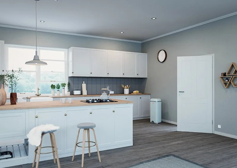
If you want a bright home and you do not want the doors to draw attention, matte white is the choice. Unlike the glossy version, it does not show fingerprints and does not reflect light aggressively. It suits a small flat in Bucharest just as well as a villa with high ceilings. See the range of painted white interior doors.
Grey, anthracite grey and light grey
Light grey behaves like white, but more discreetly. Anthracite grey is almost black without being as visually harsh, good for modern interiors with metallic accents. The difference between them is not just the tone, but also how much the door "speaks" in the room. Anthracite stands out, light grey blends in.
Wenge and brown
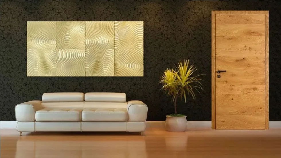
These are classic dark-wood colours, with a sense of elegance and weight. They go very well with light flooring, natural or grey oak, because they create contrast without looking forced. They do not date easily. It is the kind of choice you make once and never regret.
Natural wood tones
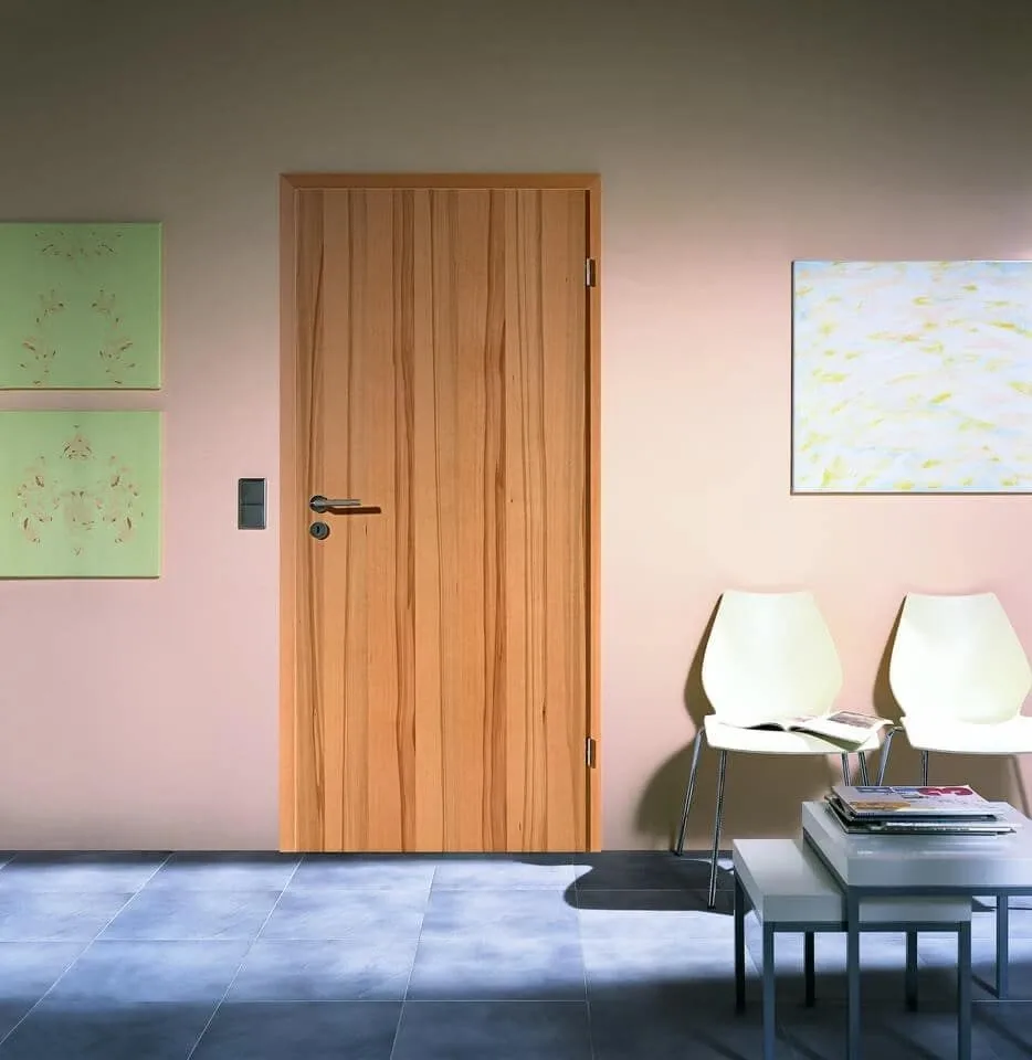
If you want the door to feel like part of the structure of the house rather than an added element, natural wood tones are the answer. They lean towards Scandinavian or rustic style and match almost any combination of wooden furniture. See the collection of wooden interior doors.
Which colours suit each decorating style
The style of your house narrows the choice faster than any other rule.
| Style | Recommended colours | What characterises the style |
|---|---|---|
| Modern | White, grey, black | Simple lines, clean surfaces, controlled contrast |
| Scandinavian | Light wood, white, light grey | Plenty of light, natural textures, a sense of space |
| Industrial | Black, anthracite grey, dark brown | Raw materials, matte finishes, metallic accents |
| Classic | Mahogany, brown, cherry | Elegance, crafted details, warm and deep tones |
| Rustic | Light wood, dark green, blue | Authenticity, weathered finishes, a natural feel |
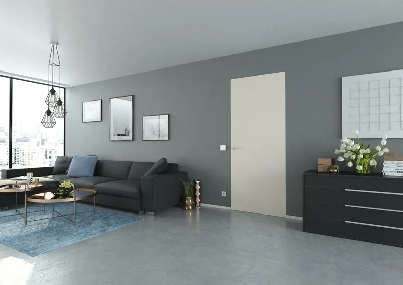
If you are leaning towards a minimalist style, look at the Modern or Scandinavian column and consider a door with no visible frame. Without a visible frame, the door disappears into the wall and highlights exactly the simplicity you are after in a minimalist interior.
How do you match the door colour with the flooring and furniture?
Matching the flooring with the doors is an important detail for the look of a premium home. This is where the look is lost most often, because the door is chosen without taking the existing floor into account.
A few combinations that work almost every time are:
- Light flooring, light or natural oak, with a dark door. The contrast adds depth without looking heavy.
- Dark flooring with a light door. The reverse of the above, just as effective, especially in rooms with little light.
- White walls with a white door. It works, but you risk monotony. A discreet frame or a handle in a different shade breaks the "everything is the same" effect.
The same principles of contrast or harmony apply to the rest of the elements in the room.
How do you choose the colour according to the room and the light?
The same colour looks different in the living room compared with the bedroom, because the light and the function of the room differ.
- Living room: the room where you can carry a bolder colour, anthracite grey or wenge, because the space is usually larger and better lit.
- Dark room: if the window is small or the orientation does not catch direct sunlight, choose a light, matte colour. It reflects more light and does not visually weigh the space down.
- Bedroom: warm tones — beige, light brown, warm white — support the sense of calm you need in a bedroom.
Which common mistakes should be avoided when choosing the colour?
- Choosing the door without looking at the flooring. This is the most common mistake. A colour that is good in isolation can look poor next to the floor you already have.
- Dark colours in small rooms. Black or dark-brown doors can make a small space feel even tighter.
- Testing the colour only in the shop. The light there is nothing like the light in your home. A shade looks different at 9 in the morning compared with 7 in the evening.
- Ignoring the style of the house. A door with a glossy, modern finish does not fit into a rustically decorated home, however good it looks on its own.
Can you customise the colour of your door to order?
Yes. At Kulttur, every interior door is made to order, including painted in the shade you have chosen yourself, not only from the standard palette. If you have found a combination in this article that suits you, but the exact colour is not on the site, tell us what you want and we will discuss it.
We do not give price figures for customisation here, because it depends on the model, the finish and the quantity. The simplest thing is to talk to a consultant and get the exact answer for your project.
Once you have chosen the colour, next comes the installation of the interior door, part of the same process for integrating the doors correctly into the look of the interior.
Frequently asked questions about interior door colours
How do I choose the door colour for a dark room?
Choose a light, matte colour. It reflects the existing light instead of absorbing it and does not visually weigh down a space that already has little natural light.
Do light-coloured doors get dirty or wear out faster?
It depends on the finish, not just the shade. A quality matte finish holds up just as well regardless of colour. The visible difference is that on matte surfaces, in general, marks show less than on glossy ones.
What dimensions do Kulttur interior doors come in, regardless of the colour chosen?
Every door is made to your order, so the dimension is not a limitation, it is a choice. See the full range of interior doors for context.
Does Kulttur paint interior doors in a custom colour?
Kulttur does this as part of the standard ordering process, not as a separate service. You choose the model, you choose the colour, you receive the door exactly as you wanted it.
How much does customising the colour of a made-to-order door cost?
We do not have a standard price, because each custom colour is calculated separately, according to the model and the finish. The simplest thing is to discuss your project with us directly.